Making your own Modules
Aton Addons uses a modular structure for the features. This makes it very easy to add more features to the mod by just adding new Modules to it.
In the following I will use the Remove Front View Module as an example to explain how modules work and how you can make your own one.
All Modules inherit from the Module Class. If you don't know what that means check out this page.
This class supplies fields and methods that will be used by all Modules. It enables the Module Manager to takes care of a lot of functionality for you.
One of these things are configurable settings. These are contained within the modules and are automatically added to the gui and saved in the config, once the Module is added to the Module Manager.
It also provides a keybinding for you Module. By default, pressing this key will toggle the Module.
This entails registering or unregistering the Module to / from the Event Bus, which will enable / disable all the event
listeners within the Module.
This behaviour can be changed by overriding the open functions onEnable() and onDisable().

By doing this you can for example make the keybinding perform an action when the Module is enabled.
To make your own module you have to inherit from the Module Class.
Generally you want exactly one Instance of your Module.
To achieve this kotlin allows you to directly create an Object for your Module, taking out the intermediate step of
creating and then instancing a Class.
This will then look like:
object RemoveFrontView : Module(
    "No Front View",
    category = Category.MISC,
    description = "Skips the front view when toggling perspective."
){
    //Implementation
}
You always have to supply the Module Constructor with at least a name for your Module. But you should also always specify a category. This determines where it will be listed in the GUI. And a description. This description is shown at the top of the advanced window in the gui and should contain a general description of what your module does, and how to use it.
Now to do that yourself you should locate the atonaddons.module.impl directory and choose the category you want
your module to be in. Right-click the directory for that category and click on New -> kotlin Class/File.

In the menu that now opened select Object and type the desired name for your Module in the text field.

In this file you can then code your Module.
Something else you should get in the habit of doing is adding documentation comments to your code.
Those comments are created with a backslash and two stars /** COMMENT */.
In code this looks like
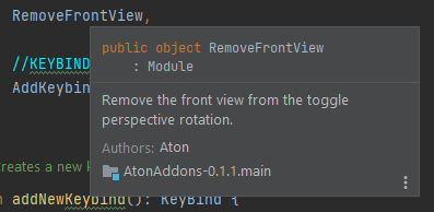
/**
 * Remove the front view from the toggle perspective rotation.
 * @author Aton
 */
object RemoveFrontView
and can be used to give some information on the module to other people and you, when looking at the code.
The IDE will show those to give you additional information when hovering references.
You can and should also use these comments for values and methods within your Classes.
Now you can populate the Module. The first thing you will want to do is add all the settings you need.
Settings are defined as fields within the Module. They are Instances of one of the
Setting Classes.
These can be found within the atonaddons.module.settings.impl package.
So far you can choose from BooleanSetting, NumberSetting, StringSetting, SelectorSetting,
ColorSetting and ActionSetting.
For details on the individual usages look at the following collapsed section.
Settings
Boolean Setting
Boolean Settings just store a boolean (true or false) value and are represented by a checkbox in the GUI.
You can create a Boolean Setting like shown in the following example.
private val alerts = BooleanSetting("Alerts", false, description = "Plays a sound when your cooldown is over.")To then access the value use:
alerts.enabledNumber Setting
Number Settings can be used for any kind of number input and is represented by a slider in the GUI.
Only double precision numbers are supported by the setting, but you can still use it for all number by casting the
value to the desired Type.
Number Settings always come with a range of allowed values and an increment in between values.
By configuring the increment as 1.0 you can limit the possible values to integers.
You can create a Number Setting like shown in the following example.
private val volume = NumberSetting("Volume", 1.0, 0.0, 1.0, 0.01, description = "Volume of the alert.")To then access the value use:
volume.value            // If you need a double value
volume.value.toFloat()  // If you need a float
volume.value.toInt()    // If you need an integer
String Setting
String Settings are made to store a custom string and are represented by a text field in the GUI. You can specify the maximum allowed length for the string.
The following example shows how to create a String Setting.
private val customSound = StringSetting("Custom Sound", "mob.blaze.hit", description = "Name of a custom sound to play. This is used when Custom is selected in the Sound setting.")To then access the string use:
customSound.textSelector Setting
Selector Settings let the user choose exactly one option out of a preset list of availiable options. In the gui there settings are represented by a button that can be used to cycle through the options and can be expanded to a combo box. The possible options are represented by an Array List of Strings
The following example shows how to create a Selector Setting.
private val sound: SelectorSetting
init{
    val soundOptions = arrayListOf(
        "mob.blaze.hit",
        "fire.ignite",
        "random.orb",
        "random.break",
        "mob.guardian.land.hit",
        "Custom"
    )
    sound = SelectorSetting("Sound", "mob.blaze.hit", soundOptions, description = "Sound selection.")
}
You can also inline the options, or define them outside the init{} block, but this is the cleanest way to do it.
The Selector Setting allows you to either access the selected String or its index in the list of options. To access these use:
sound.selected  // For the String
sound.index     // For the index of the selection in the list of options.
Color Setting
Color Settings allow you to store color values in the form of the java.awt.Color Type.
It also provides a lot of functionality to directly access individual color channels.
Both RGB (Red, Green and Blue) and HSB (Hue, Saturation and Brightness) color models are supported as well as an alpha
component.
In the gui Color Settings are represented by a set of 3 or 4 sliders depending on whether an alpha value is allowed for transparency. The three color sliders will either be red, green and blue, or hue, saturation and brightness, depending on which color model is selected in the Click Gui Module.
You can create a Boolean Setting like shown in the following example.
val color = ColorSetting("Color", Color(134,26,71), false, description = "Color theme in the gui.")You now have a lot of option to access and modify the color values.
The first option is to use the java.awt.Color Class to handle the color values.
color.value         // Returns the currently selected
color.value.rgb     // Returns an integer consisting of 2 bits for each channel in the RGBA color model.
// This integer has the form 0xrrggbbaa with 2 bits each for red, green, blue and alpha.
This way of accessing the color value is great if you are only interested in reading the value.
If you want to access or modify individual color channels in either tje RGN or HSB model, the Color Setting Class lets you do so and will automatically update all other values regarding the changes you make.
color.red        // access the red value of the color; 2 bit Int (0 - 255)
color.green      // access the green value of the color; 2 bit Int (0 - 255)
color.blue       // access the blue value of the color; 2 bit Int (0 - 255)
color.hue        // access the hue value of the color; 2 bit Int (0 - 255)
color.brightness // access the brightness value of the color; 2 bit Int (0 - 255)
color.saturation // access the saturation value of the color; 2 bit Int (0 - 255)
color.alpha      // access the alpha value of the color; 2 bit Int (0 - 255)
Assigning a new value to any of these variables will automatically update all other values.
Action Setting
Action Settings allow you to create a Button in the gui that runs the specified code when clicked.
When creating an Action Setting you have to supply it with a lambda function containing the code that you want to be run when the button is pressed. In code this looks like:
private val removeButton = ActionSetting("Remove Key Bind", description = "Removes the Key Bind.").apply {
    action = {
        ModuleManager.removeKeyBind(this@KeyBind)
    }
}
You can define all of your settings as private values within your Module, unless you need to reference them from other classes. You don't have to worry about the gui or the config not being able to access your settings because of them being private. We will take care of that later, when we register the settings to the gui and config.
All Settings need a unique name in their constructor, followed by a default value as well as optional additional configurations depending on the type and finally a description. The description will be shown in the advanced window of the gui and is meant to tell the used what exactly the setting is ued for. Additionally, you can also specify whether you want the setting to be hidden in the gui. This is useful if you want to store a value in the config, but don't have any reason to show it in the gui.
In code this can then look like the following Number Setting creation taken from the Dungeon Warp Timer Module.
private val volume = NumberSetting("Volume", 1.0, 0.0, 1.0, 0.01, description = "Volume of the alert.")After defining all your settings like this you still have to add them to the gui and config.
This is done with the addSettings() method that your Module inherits from the Module class and looks like:
    init {
        this.addSettings(
            alerts,
            trackInBackground,
            volume,
            onlyOwnCD,
            xHud,
            yHud
        )
}The last step required to make your Module show up in the GUI and work, is to add it to the Module Manager.
All you have to do for that is to locate ModuleManager.kt (just press shift twice and type it) and in there add
your module to the modules list.
The order of that list influences the order in the GUI.