
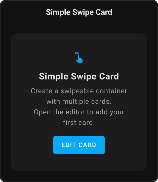
A swipeable container card for Home Assistant that allows you to add multiple cards and swipe between them.
Simple Swipe Card is a customizable container for Home Assistant that lets you place multiple cards in a single space and navigate between them with intuitive swipe gestures. The card optimizes dashboard space by grouping related information while providing a mobile-friendly interface with smooth touch and mouse navigation. It features pagination indicators, adjustable card spacing, and full visual editor support. Ideal for creating room-specific views, device dashboards, or organizing related information without cluttering your dashboard, Simple Swipe Card enhances both functionality and user experience with minimal configuration.
- Swipe between multiple cards
- Pagination dots
- Configurable card spacing
- Visual editor support
- Loopback mode for continuous navigation
- Support for both horizontal and vertical swiping
- Automatic Slideshow (Auto-Swipe):
- Cards can cycle automatically at a user-defined interval
- Auto-swipe intelligently pauses during manual user interaction (e.g., manual swipe, pagination click) and resumes after 5 seconds (not configurable)
- Integrates with Loopback Mode for continuous cycling or uses a "ping-pong" effect if loopback is disabled
- Reset After Timeout: Automatically return to a target card after inactivity
- Open HACS
- Search for "Simple Swipe Card" and install it
Or click this button to open the repository page in HACS:

- Open HACS
- Click on the three dots in the top right corner
- Select "Custom repositories"
- Add this repository URL (https://github.com/nutteloost/simple-swipe-card)
- Click "Add"
- Search for "Simple Swipe Card" and install it
- Download
simple-swipe-card.jsfrom the latest release - Copy it to
config/www/simple-swipe-card/simple-swipe-card.js - Add the following to your configuration.yaml:
lovelace:
  resources:
    - url: /local/simple-swipe-card/simple-swipe-card.js
      type: module
- Restart Home Assistant
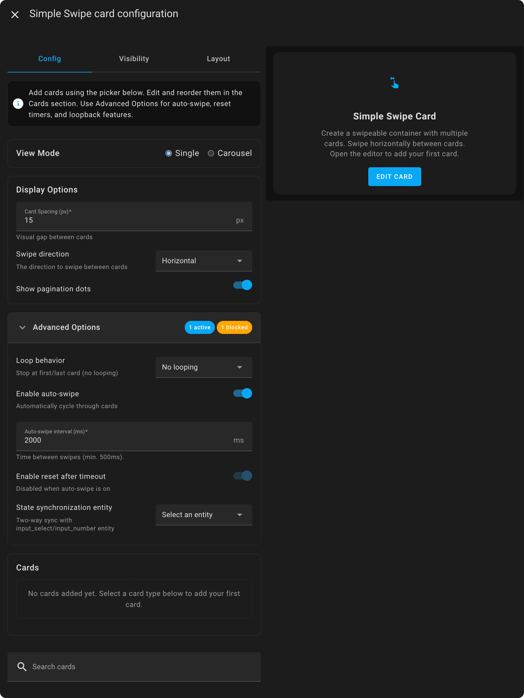
The Simple Swipe Card includes a visual editor that appears when you add or edit the card through the Home Assistant UI. Features include:
- Display Options:
- Simple number input for card spacing
- Selection for swipe direction (horizontal/vertical)
- Visual on/off toggle for pagination dots
- Advanced Options section:
- Toggle for loopback mode
- Toggle for enabling auto-swipe
- Number input for auto-swipe interval (in milliseconds)
- Reset after timeout configuration options
- Cards section:
- Reorder cards for swiping order
- Visibility condition indicators for conditional cards
- Real-time preview of changes
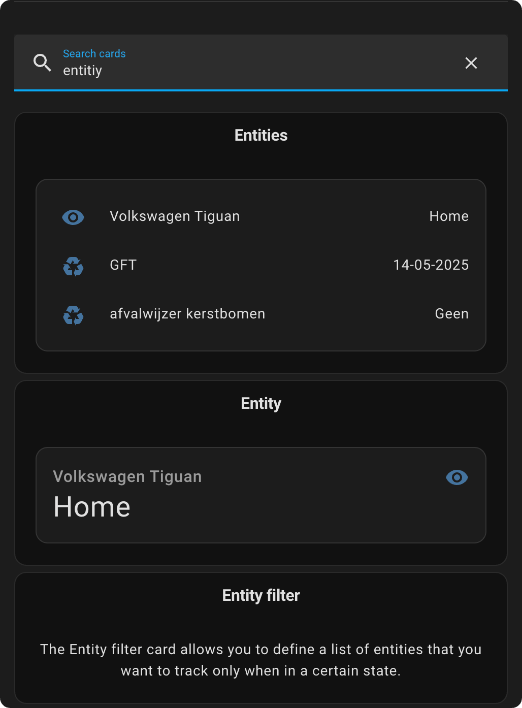
You can search for cards you want to add to the Simple Swipe Card in the search bar. Click on them to add them to the configuration.
You can edit the added cards by clicking on the ✏️ icon.
This card can be configured using the visual editor or YAML.
| Name | Type | Default | Description |
|---|---|---|---|
| cards | list | Required | List of cards to display |
| show_pagination | boolean | true | Show/hide pagination dots |
| card_spacing | number | 15 | Space between cards in pixels |
| enable_loopback | boolean | false | When enabled, swiping past the last card will circle back to the first card, and vice versa |
| swipe_direction | string | 'horizontal' | Direction for swiping. Options: 'horizontal' or 'vertical' |
| enable_auto_swipe | boolean | false | When enabled, the card will automatically swipe between slides |
| auto_swipe_interval | number | 2000 | Time between automatic swipes in milliseconds (minimum 500ms). Only active if enable_auto_swipe is true |
| enable_reset_after | boolean | false | Enable automatic return to target card after inactivity |
| reset_after_timeout | number | 30000 | Time in milliseconds before resetting (minimum 5000ms) |
| reset_target_card | number | 1 | Index of card to return to (1 = first card) |
type: custom:simple-swipe-card
cards:
  - type: weather-forecast
    entity: weather.home
  - type: entities
    entities:
      - sensor.temperature
      - sensor.humidity
  - type: media-control
    entity: media_player.living_room
show_pagination: true
card_spacing: 15
enable_loopback: true
swipe_direction: horizontal
enable_auto_swipe: false
auto_swipe_interval: 3000
enable_reset_after: true
reset_after_timeout: 45000
reset_target_card: 1Individual cards within the Simple Swipe Card can be conditionally shown or hidden using visibility conditions. Multiple conditions use AND logic (all must be true).
⚠ Important: Visibility conditions are added to individual cards within your Simple Swipe Card configuration, not to the Simple Swipe Card configuration itself.
The Simple Swipe Card provides extensive customization capabilities through two primary methods: Home Assistant themes and card-mod styling. This flexible approach allows you to establish consistent styling across all card instances while maintaining the ability to customize individual cards as needed.
Apply styling globally across all instances of Simple Swipe Card by adding theme variables to your Home Assistant configuration. This method is ideal for maintaining consistent styling throughout your dashboard.
To apply these customizations, add them to your theme in your configuration.yaml:
frontend:
  themes:
    simple_swipe_theme:
      # Your existing theme properties
      primary-color: '#2196f3'

      # Simple Swipe Card customizations
      simple-swipe-card-pagination-dot-active-color: '#ff5722'
      simple-swipe-card-pagination-dot-size: '10px'
      simple-swipe-card-pagination-dot-spacing: '6px'
      simple-swipe-card-transition-speed: '0.4s'
      simple-swipe-card-pagination-background: 'rgba(0, 0, 0, 0.1)'
# Add any other variables from the complete CSS referenceApply styling directly to individual card instances using card-mod. This method provides maximum flexibility and allows for unique styling of specific cards. Card-mod styles take precedence over theme variables, enabling you to override global themes for specific instances.
type: custom:simple-swipe-card
cards:
  - type: weather-forecast
    entity: weather.home
  - type: entities
    entities:
      - sensor.temperature
card_mod:
  style: |
    :host {
      --simple-swipe-card-pagination-dot-active-color: #ff5722;
      --simple-swipe-card-pagination-dot-size: 12px;
      --simple-swipe-card-transition-speed: 0.5s;
      /* Add any other variables from the complete CSS reference */
}All CSS variables listed below can be used in both Home Assistant themes and card-mod styling configurations. These variables provide comprehensive control over the visual appearance and behavior of the Simple Swipe Card.
/* Pagination Dot Styling */
--simple-swipe-card-pagination-dot-size: 8px;                                   /* Diameter of inactive pagination dots */
--simple-swipe-card-pagination-dot-active-size: 8px;                            /* Diameter of the active pagination dot */
--simple-swipe-card-pagination-dot-active-color: var(--primary-color, #03a9f4); /* Color of the currently selected dot */
--simple-swipe-card-pagination-dot-inactive-color: rgba(127, 127, 127, 0.6);    /* Color of inactive pagination dots */
--simple-swipe-card-pagination-dot-spacing: 4px;                                /* Horizontal/vertical space between dots */
--simple-swipe-card-pagination-border-radius: 50%;                              /* Border radius of dots (50% = circle) */
--simple-swipe-card-pagination-dot-active-opacity: 1;                           /* Opacity of the active pagination dot */
--simple-swipe-card-pagination-dot-inactive-opacity: 1;                         /* Opacity of inactive pagination dots */

/* Pagination Container Styling */
--simple-swipe-card-pagination-background: transparent;                         /* Background color of pagination container */
--simple-swipe-card-pagination-padding: 4px 8px;                                /* Padding around the pagination dots */
--simple-swipe-card-pagination-bottom: 8px;                                     /* Distance from bottom edge (horizontal mode) */
--simple-swipe-card-pagination-right: 8px;                                      /* Distance from right edge (vertical mode) */

/* Animation and Transition Effects */
--simple-swipe-card-transition-speed: 0.3s;                                     /* Duration of slide transition animations */
--simple-swipe-card-transition-easing: ease-out; /* Easing function for slide animations */You can use any valid CSS transition timing function for simple-swipe-card-transition-easing:
# Example animation customizations
simple-swipe-card-transition-speed: '0.5s'                          # Slower animation
simple-swipe-card-transition-easing: 'ease-in-out'                  # Smooth in and out
simple-swipe-card-transition-easing: 'cubic-bezier(0.4, 0, 0.2, 1)' # Material Design easing
simple-swipe-card-transition-easing: 'linear'                       # Constant speed
simple-swipe-card-transition-easing: 'ease-in' # Slow start, fast endWhen both theme variables and card-mod styling are present, the following hierarchy applies:
- Card-mod styles (highest priority)
- Theme variables
- Default card styling (lowest priority)
This hierarchy allows you to establish baseline styling through themes while maintaining the flexibility to customize individual card instances as needed.
Check out my other custom cards for Home Assistant:
- Todo Swipe Card - A specialized swipe card for todo lists in Home Assistant with custom styling
- Actions Card - Wraps another Home Assistant card to add tap, hold, and double-tap actions
Enjoying my cards? Consider donating a beer (or two)! It will keep me going.